
About UI Mockup Settings
Overview
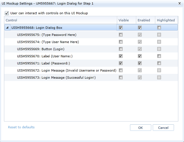
Blueprint allows you to alter the way a UI mockup appears in your use case simulation. From the Use Cases editor, you can alter the UI Mockup settings on individual use case steps.
You can adjust the settings of individual shapes within the UI mockup:
The UI mockup settings are as follows:
-
User can interact with controls on this UI Mockup
This option is selected by default. When you deselect this option, any viewers of the simulated use case cannot interact with the UI mockup on this step.
-
Visible
When selected, the subartifact is visible in the simulation of this use case step. When deselected, the subartifact is not visible in the simulation of this use case step.
-
Enabled
When deselected, any applicable interactive controls cannot be interacted with. For example, if the subartifact is a dropdown list, viewers cannot select items from the menu. When deselected, both interactive shapes and non-interactive shapes appear disabled in the simulation.
-
Highlighted
When selected, the subartifact is outlined in blue in the simulated use case step.
 When selected, viewers of the use case can interact with any applicable interactive controls. For example, if the subartifact is a text box, viewers can enter text in the field.
Note: You can reset the UI mockup settings to the version that was last saved in the UI Mockup editor by clicking Reset to defaults.
Learn More
Adding an internal alternate flow
Adding an external alternate flow
Setting start and return steps
Adding an actor to a use case step
Including a use case in a step